剑桥商务英语学习笔记
1352 浏览 5 years, 10 months
1 ielts-writing-1
版权声明: 转载请注明出处 http://www.codingsoho.com/Line Chart
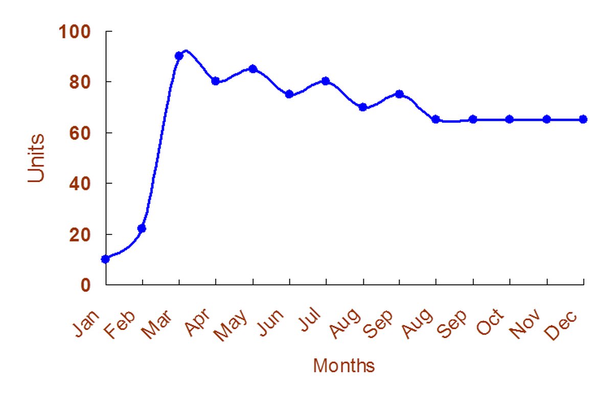
There was a slight growth in the sales of computers from Jan to Feb. However, they increased dramatically to a peak in the next month. After that, there was a downward trend in sales between Mar and Aug, which leveled off by the end of Dec.
Single Line Chart
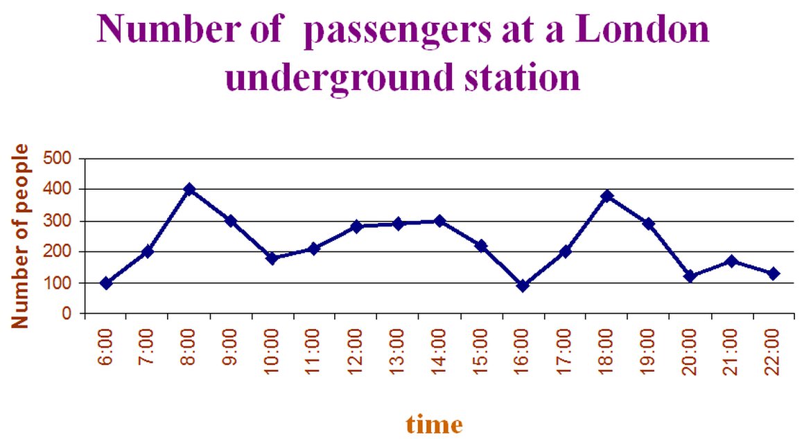
The line graph shows the fluctuation in the number of people at a London underground station over the course of a day.
The busiest time of the day is in the morning. There is a sharp increase between 06:00 and 08:00, with 400 people using the station at 8 o'clock.
After this the numbers drop quickly to less than 200 at 10 o'clock. Between 11 am and 2 pm the number rises, with a plateau of just under 300 people using the station.
In the afternoon, numbers decline, with less than 100 using the station at 4 pm. There is then a rapid rise to a peak of 380 at 6 pm.
After 7 pm, numbers fall significantly, with only a slight increase again at 8pm, tailing off after 9 pm.
Overall, the graph shows that the station is most crowded in the early morning (around 08:00) and early everning (around 18:00) periods.
Two Line Chart
The graph below shows the numbers of passengers in London at different times of the day.
Summarise the information by selecting and reporting the main features and make comparisons where relevant.
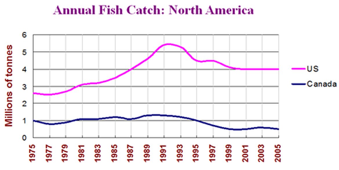
The graph shows changes in fish catches for the US and Canada over the last 30 years.
Between 1975 and 1981, US fish catches averaged between 2.5 and 2.75 million tonnes per year, while Canadian landings fluctuated between 600,000 and 900,000 tonnes.
In 1981, however, there was a significant increase in fish caught in the US, and this rise continued and peaked at 5.6 million tonnes in 1991. During the same period, Canada’s catch went up from 1 million to 1.6 million tonnes, a growth of over 50%.
From 1991 onwards, a sudden decline in fish catching was reported in both countries. US figures plummeted to 4 million tonnes in 2001, a drop of 28%, and Canadian catch plunged to 0.5 million tonnes, a decrease of 66%.
In the following four years, US catches remained stable at 4 million tonnes, while Canadian catches raise and fell around the 0.5 million tonne mark.
In general, fish catches have declined dramatically in the both US and Canada since the early 1990s. Although Canadian production was much lower, it echoed US figures, declining or increasing at the same rate.
Bar Chart
The graph below shows the number of victims of heart attacks by gender and age.
Summarize the information by selection and reporting the main features and make comparisons where relevant.
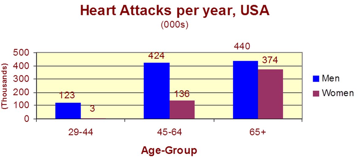
The graph shows how age and gender influence the frequency of heart attacks in the US.
The 29-44 age group is where heart attacks are least likely to occur. The number of women who suffer heart attacks in this group is negligible – only 3000 per year, compared to 123,000 men.
However the number of men and women with heart attacks rises dramatically between 45 and 64, with over half a million per year. Over 420,000 men a year in this age group have heart attacks. The incidence amongst women increases – women have one heart attack for every three men in this age group.
Over the age of 65, the number of men suffering heart attacks only increases slightly. However there’s a huge increase in the number of women with heart attacks – they comprise over 40% of all victims in this age group.
In general, males are more likely than females to suffer from heart attacks, but with the growth of age, females comprise an increasing larger percentage of heart attack victims.
The chart below show the different level of post-school qualifications in Australia and the proportion of men and women who held them in 1999.

The chart gives information about post-school qualifications in term of the different levels of further education reached by men and women in Australia in 1999.
We can see immediately that there were substantial differences in the proportion of men and women at different levels.
The biggest gender difference is at the lowest post-school level, where 90% of those who held a skilled vocational diploma were men, compared with only 10% of women.
By contrast, more women held undergraduate diplomas (70%) and marginally more women reached degree level (55%).
At the higher levels of education, men with postgraduate diplomas clearly outnumbered their female counterparts (70% and 30%, respectively), and also continued 60% of Master’s graduates.
Thus, we can see that more men than women held qualifications at the lower and higher levels of education, while more women reached undergraduate diploma level than men. The gender difference was smallest at the level of Bachelor’s degree, however.
Pie Chart
The graph below shows the spending patterns of US households in 1966 and 1996.
Summarize the information by selecting and reporting the main features and make comparisons where relevant.
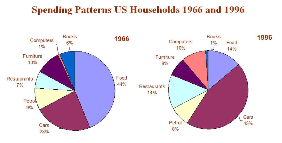
The two pie charts compare the household expenditures in US familiars in 1966 and 1996.
Food and cars make up the two biggest items of expenditure in both years. Together they comprised over half of household spending. Food accounted for 44% of spending in 1966, but this dropped by two thirds to 14% in 1996. However, the outlay on cars doubled, rising from 23% in 1966 to 45% in 1996.
Other areas changed significantly. Spending on editing out doubled, climbing from 7% to 14%. The proportion of salary spent on computers increased dramatically, up from 1% in 1996 to 10% in 1996. However, as computer expenditure rose, the percentage of outlay on books plunged from 6% to 1%.
Some areas remained relatively unchanged. Americans spent approximately the same percentage of their salary on petrol and furniture in both years.
In conclusion, increased amounts spent on cars, computers and eating out were made up for by drops in expenditure on food and books.
The graph below shows the age structure of the population in one European country in four years.
Summarize the information by selecting and reporting the main features and make comparisons where relevant.
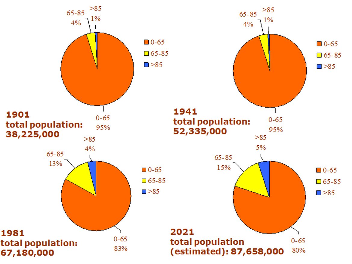
The graphs compare the population makeup of one European country every forty years from 1901 to 1981, and estimated number in 2021.
There was a huge increase in the number of people in this country from 38,225,000 in 1901 to 67,180,000 eighty years later, and this upward trend is expected to last through to the year 2021, when the population is estimated at 87,658,000, more than double the 1901 figure.
In 1901 and 1941, the population structure in this country was completely the same, with an overwhelming majority of its population (95%) below 65, 4% between 65 and 85 and only 1% over 85 years old.
However, the year 1981 saw a sharp increase in the percentage of the elderly. Altogether, they made up 17% of the total population whereas the projection for the year 2021 shows that they will continue to grow but less dramatically to 20% of the total population (15% for 65-85 year-olds and 5% for over-85-year-olds).
In summary, changes are taking place not only in the number of people but also in the ages of the people who make up the population in this European country, indicating it is advancing into an aging society.
Table
The table shows several economic and social indicators for four African countries.
Summarise the information by selecting and reporting the main features and make comparisons where relevant.

This table compares the social and economic growth of four African countries based on their population size, access to safe water and infant mortality rate.
Among the four countries listed, South Africa has the largest pollution (37.2 million). Sudan, with 1.2 million fewer people, is the second largest country in terms of population, followed by Morocco and Algeria, both having 28 million.
Moreover, easy access to water can be found in three countries (Algeria, Morocco and South Africa), where a significantly higher percentage of urban dwellers than rural residents have access to safe water. In Sudan, however, water condition is a little worse: A quarter of the population, in both urban and rural areas, are denied access to safe water.
Finally, infant mortality rate is considerably lower in South Africa (28‰), Morocco (27‰) and Algeria (36‰) than in Sudan (75‰).
Overall, the chart suggests that Sudan is the least developed in social and economic terms among the four countries surveyed.
The table below lists the number of nights of occupancy of hotel rooms in Australia during the peak month of September in the years 2000 and 2001 and the difference expressed in percentage.
Summarise the information by selecting and reporting the main features and make comparisons where relevant.
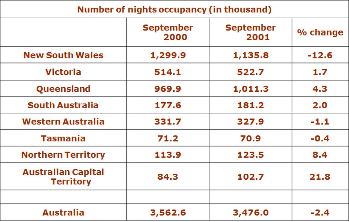
This table shows that significant changes had taken place in Australia’s hotel occupancy from September 2000 to September 2001.
On the whole, there was a slight drop of 2.4% from 3562.6 thousand nights to 3476 thousand nights in the overall hotel bed occupancy in Australia during this period. However, an actual decline was found in only three states. In two of the states the decline was slight (-1.1% in Western Australia and -0.4% in Tasmania) but a dramatic decline occurred in New South Wales (-12.6%).
By contrast, in other states, there was actually an increase in occupancy. The increase was different in different states but the greatest increase occurred in the Capital Territory (21.8%).
Moreover, the table indicates that in both September 2000 and September 2001, New South Wales had the highest hotel bed occupancy (1299.9 thousand and 1135.8 thousand respectively) while Tasmania had the lowest (71.2 thousand and 70.9 thousand respectively).
In conclusion, the table reveals that different states in Australia had different hotel occupancy rate but on the whole they received fewer guests in September 2001 than in September 2000.
真题 (9)
9-1
The two maps below show an island, before and after the construction of some turist facilities.
Summarize the information by selecting and reporting the main features, and make comparision s when relevant.
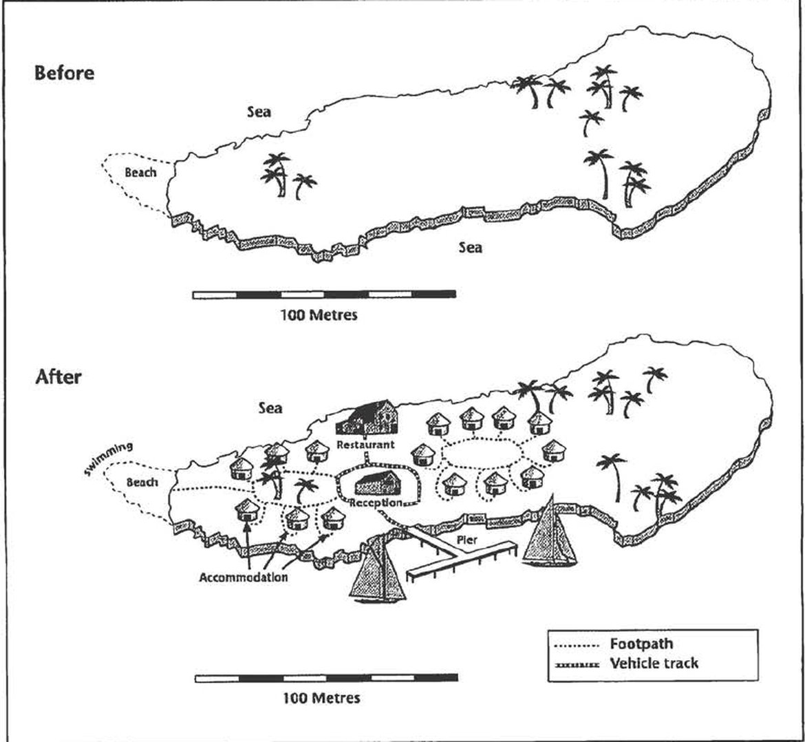
The two maps show the same island while first one is before and the second one is after the construction for tourism.
Looking first at the one before construction, we can see a huge island with a beach in the west. The total length of the island is approximately 250 metres.
Moveing to the second map, we can see that there are lots of buildings on the island. There are two areas of accommodation. One is in the west next the beach while the other one is in the centre of the island. Between them, there is a restaurant in the north and a central reception block, which is surrounded by a vehicle track. This track also goes down to the pier where peope can go sailing in the south sea of the island. Furthermore, tourists can swim near the beach in the west. A footpath connecting the western accommodation units also leads to the beach.
Overall, comparing the two maps, there are significant changes after this development. Not only lots of facilities are built on the island, but also the sea is used for activities. The new island has become a good chance for tourism.
9-2
The Chart below shows the total number of minutes ( in billions) of telephone call in the UK, divided into three categories, from 2015~2002.
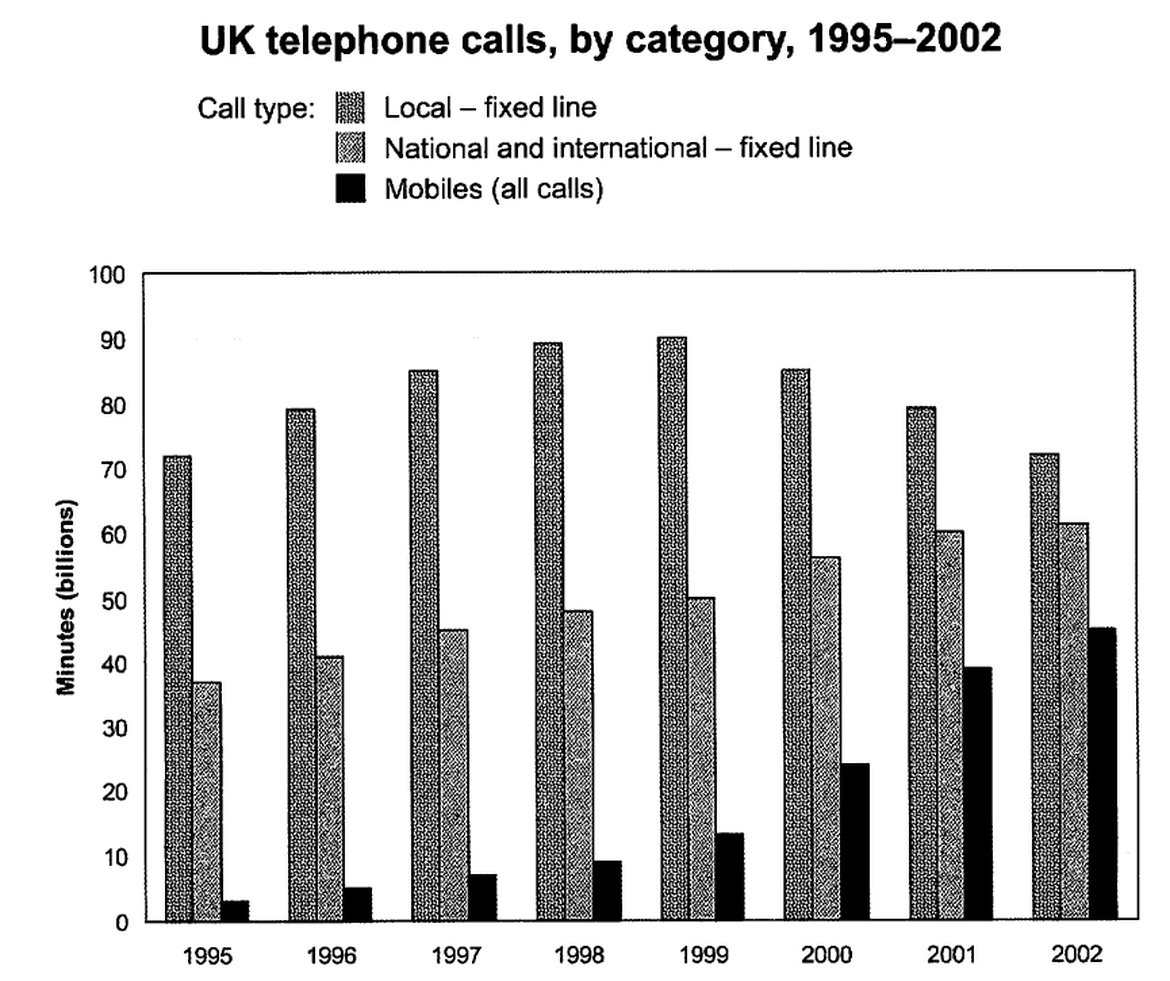
The chart shows the time spend by UK residents on different types of telephone calls between 1995 and 2002.
Local fixed line calls wre the highest throughtout the period, rising from 72 billion minutes in 1995 to just under 90 billion in 1998. After peaking at 90 billion the following year, these calls had fallen back to the 1995 figure by 2002.
National and international fixed line calls grew steadily from 38 billion to 61 billion at the end of the period in question, though the growth slowed over the last two years.
These was a dramatic increase in mobile calls from 2 billion to 46 billion minutes. This rise was particularly noticeable between 1999 and 2002, during which time the use of mobile phones tripled.
To sum up, although local fixed line calls were still the most popular in 2002, the gap between the three categories had narrowed considerably over the second half of the period in question.
9-3
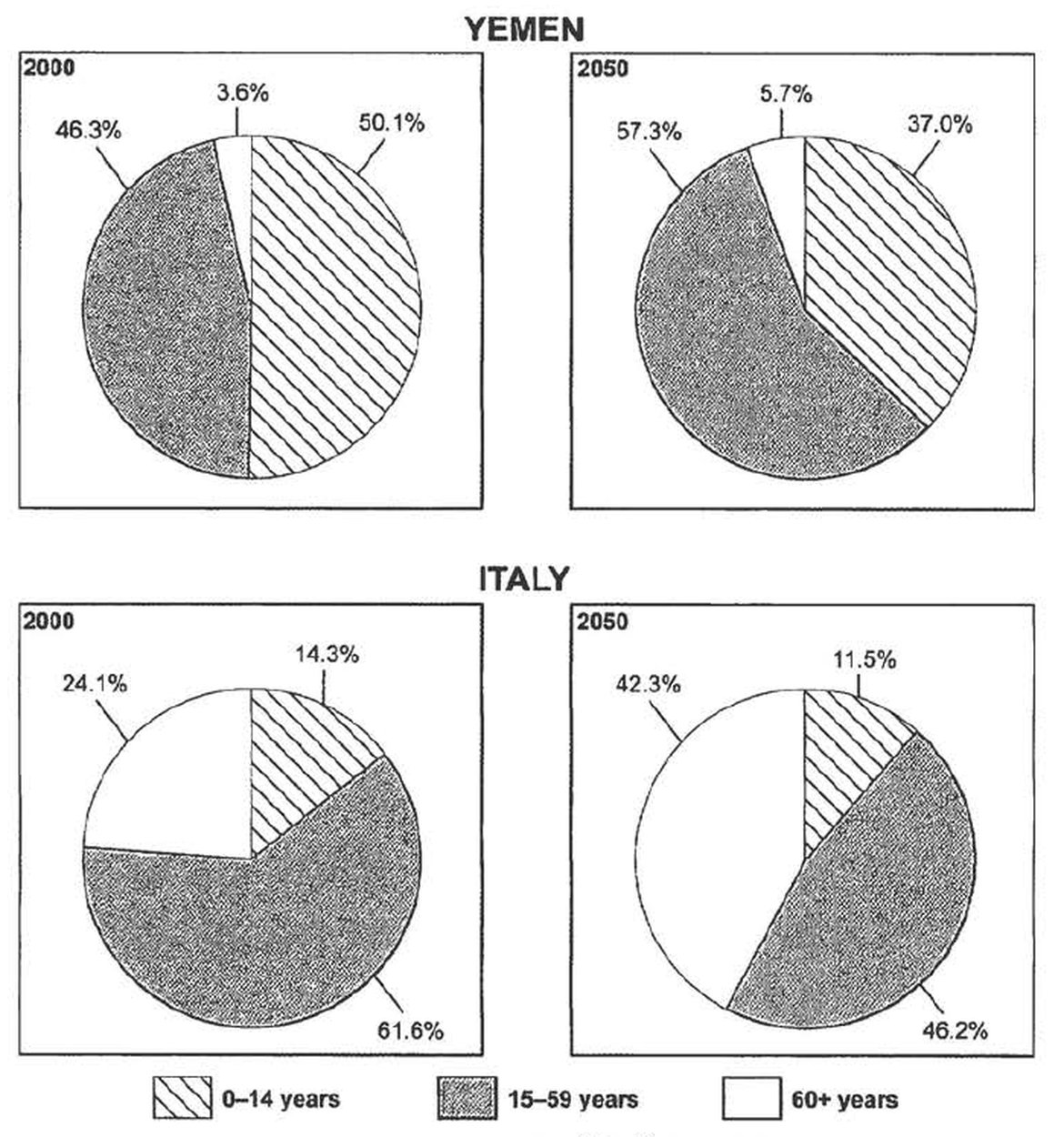
The Chart below give information on the ages of the populations of Yemen and Italy in 2000 and projections for 2050.
9-4
The graph below gives information from a 2008 report about consumption of energy in the USA since 1980 with projections until 2018.
Summarize the information by selecting and reporting the main features, and make comparision s when relevant.

The graph shows the energy consumption in the US from 1980 to 2012, and projected consumption to 2030.
Petrol and oil are the dominant fuel sources throughtout this period, with 35 quadrilion (35q) units used in 1980, rising to 42q in 2012. Despite some initial fluctuation, from 1995 there was a steady increase. This is expected to continue, reaching 47q in 2030.
Consumption of energy derived from natuarl gas and coal is similar over the period. From 20q and 15q respectively in 1980, gas showed an initial fall and coal a gradual increase, with the two fuels equal between 1985 and 1990. Consumption has fluctuated since 1990 but both now provide 24q. Coal is predicted to increase steadily to 31q in 2030, whereas after 2014, gas will remain stable at 25q.
In 1980, energy from nuclear, hydro- and solar/wind power was equal at only 4q. Nuclear has risen by 3q, and solar/wind by 2. After slight increases, hydropower has fallen back the 1980 figure. It is expected to maintain this level untial 2030, while the others shold rise slightly after 2025.
Overall, the US will continue to rely on fossil fuels, with sustainable and nuclear energy sources remaining relatively insignificant.
[Very good answer]